Guides
Build a menu section
In most cases, your site needs a menu or navbar that lists the pages available to visitors—typically implemented as a Maglev section.
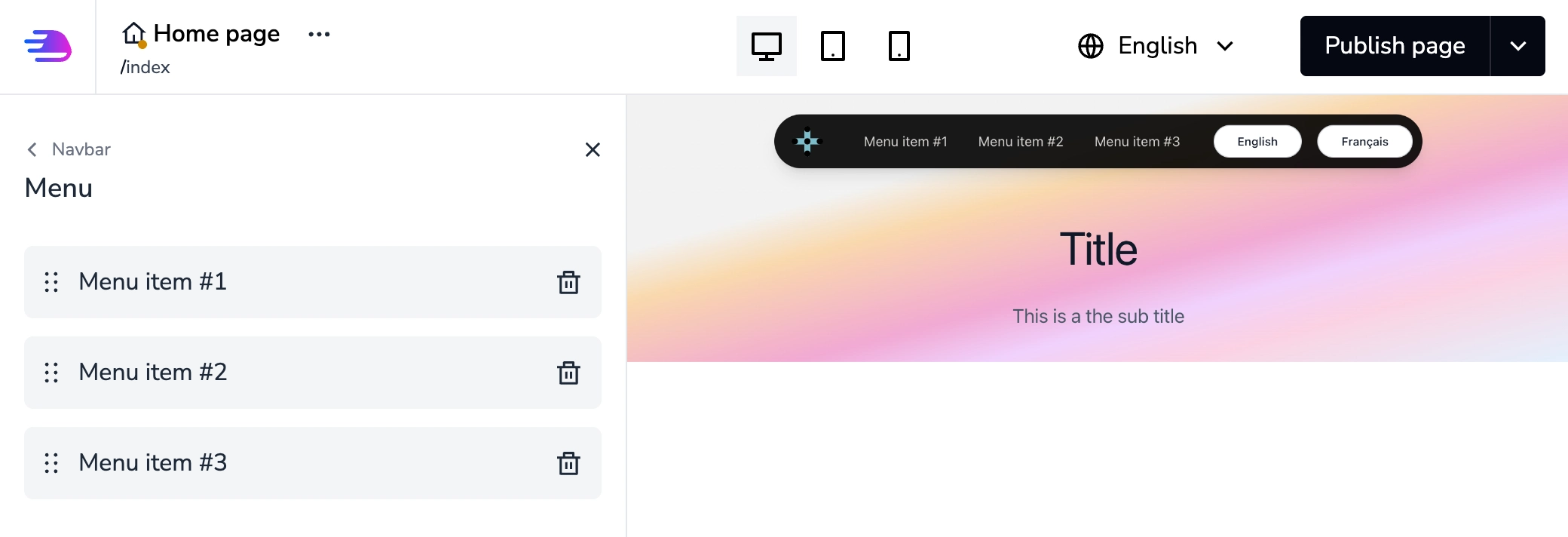
Legend. The page shows a common layout: a navbar (brand + primary links) fixed at the top, built as a site-scoped Maglev section so the same menu appears on every page, with a hero block below that belongs to the page content.
Simple menu
Generate the section
First, generate a new section from your Rails application root:
$ bundle exec rails g maglev:section navbar_01 --category=navbars --settings \
logo:image \
block:navbar_item:link:link
That creates a section named navbar_01 with a logo setting and a list of navbar item blocks.
Make sure you added the navbars category in your theme.yml file.
Tweak the section definition
Open the app/theme/sections/navbar_01.yml file with your code editor.
Because the navbar should be the same on every page, uncomment site_scoped: true in the section definition.
app/theme/sections/navbar_01.yml
# Name of the section displayed in the editor UI name: "Navbar 01" ... site_scoped: true .... blocks_label: "Navbar items" ...
Next, give each item editable link text. Instead of adding a separate text setting on the navbar_item block, use the link type’s with_text: true option.
app/theme/sections/navbar_01.yml
# Name of the section displayed in the editor UI name: "Navbar 01" ... blocks: - name: "Navbar item" type: navbar_item settings: - label: "Link" id: link type: link with_text: true default: "#" ...
To preview the section with realistic content, uncomment and edit the sample block at the bottom of the YAML file.
app/theme/sections/navbar_01.yml
# Name of the section displayed in the editor UI name: "Navbar 01" ... sample: settings: logo: "/theme/image-placeholder.jpg" blocks: - type: navbar_item settings: link: text: "Home" link_type: "url" href: "#" - type: navbar_item settings: link: text: "About us" link_type: "url" href: "#" - type: navbar_item settings: link: text: "Our products" link_type: "url" href: "#"
Write the template
This example uses Tailwind CSS for styling; you can use any CSS approach you prefer.
app/views/theme/sections/navbar_01.html.erb
<%= maglev_section.wrapper_tag.div class: 'py-6 md:py-12 px-4 md:px-6' do %> <div class="container mx-auto"> <div class="flex items-center"> <div class="relative w-32"> <%= maglev_section.setting_tag :logo %> </div> <nav class="ml-auto"> <ul class="flex items-center"> <% maglev_section.blocks.each do |maglev_block| %> <%= maglev_block.wrapper_tag.li class: 'ml-8' do %> <%= maglev_block.setting_tag :link, class: 'hover:underline' %> <% end %> <% end %> </ul> </nav> </div> </div> <% end %>
Highlighting the active menu item
Use the active? method on link settings: it is true when the link targets the current page (for link_type: "page").
Example:
app/views/theme/sections/navbar_01.html.erb
<%= maglev_section.wrapper_tag.div class: 'py-6 md:py-12 px-4 md:px-6' do %> <div class="container mx-auto"> <div class="flex items-center"> <div class="relative w-32"> <%= maglev_section.setting_tag :logo %> </div> <nav class="ml-auto"> <ul class="flex items-center"> <% maglev_section.blocks.each do |maglev_block| %> <%# Determine active state and apply appropriate classes %> <% is_active = maglev_block.settings.link.active? %> <%= maglev_block.wrapper_tag.li class: class_names("ml-8", { "text-blue-600 font-semibold": is_active }) do %> <%= maglev_block.setting_tag :link, class: class_names("hover:underline", { "text-blue-600": is_active }) %> <% end %> <% end %> </ul> </nav> </div> </div> <% end %>
Key points:
- The active? method works for links with link_type: "page"
- It automatically compares the current page ID with the link's target page
- You can use this to apply different CSS classes, styles, or content for active items
- For external URLs or other link types, active? will always return false
See Create a new section for how to test and use your section in the editor.
Multi-level menu
There are a few differences between the simple menu above and this variant.
In the section definition, set blocks_presentation to tree.
app/theme/sections/navbar_01.yml
# Name of the section displayed in the editor UI name: "Navbar 01" ... site_scoped: true ... blocks_presentation: "tree" ...
In the template, render child blocks when a top-level item has nested items.
app/views/theme/sections/navbar_01.html.erb
<%= maglev_section.wrapper_tag.div class: 'py-6 md:py-12 px-4 md:px-6' do %> <div class="container mx-auto"> <div class="flex items-center"> <div class="relative w-32"> <%= maglev_section.setting_tag :logo %> </div> <nav class="ml-auto"> <ul class="flex items-center"> <% maglev_section.blocks.each do |maglev_block| %> <%= maglev_block.wrapper_tag.li class: 'ml-8 relative' do %> <%= maglev_block.setting_tag :link, class: 'hover:underline' %> <% if maglev_block.children? %> <div class="absolute px-2 py-2"> <ul> <% maglev_block.children.each do |nested_maglev_block| %> <%= nested_maglev_block.wrapper_tag.li class: 'my-2' do %> <%= nested_maglev_block.setting_tag :link, class: 'hover:underline' %> <% end %> <% end %> </ul> </div> <% end %> <% end %> <% end %> </ul> </nav> </div> </div> <% end %>
Here is the content we can use to test our section:
app/theme/sections/navbar_01.yml
# Name of the section displayed in the editor UI name: "Navbar 01" ... sample: settings: logo: "/theme/image-placeholder.jpg" blocks: - type: navbar_item settings: link: text: "Home" link_type: "url" href: "#" - type: navbar_item settings: link: text: "About us" link_type: "url" href: "#" children: - type: navbar_item settings: link: text: "The company" link_type: "url" href: "#" - type: navbar_item settings: link: text: "Our team" link_type: "url" href: "#"
The only structural change in the sample data is the children key on the block that has sub-items.
Menu with different types of navbar items
Coming soon