Concepts
Overview
Lego bricks
Based on our experience of crafting sites for various clients, we came to the conclusion that most of the time a site is composed of various marketing or content oriented bricks stacked in a vertical up-down direction.
We can say for sure it's definitively not just a trend in the web design world simply because it's the best way possible to read easily the content of a site.
In Maglev, we named sections those "Lego" bricks.
You can build almost any kind of section—from simple hero bands to dense product grids, timelines, FAQs, or one-off campaign layouts—and make every meaningful piece editable in the visual editor (copy, images, links, toggles, lists, and structured settings). If you can render it in your Rails stack and describe its fields, it belongs in your section library.
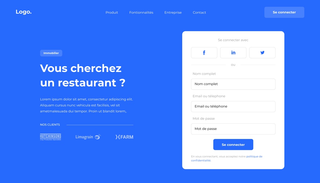
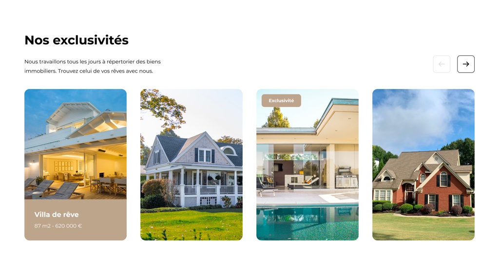
To give you a good example of what a section could be, here are screenshots from a library of sections built for a client. You build your own library of sections for each client—tailored to that project’s design system, brand, and content model.


The Rails way
Maglev’s editor is built to use Rails conventions end to end: server-rendered views, ViewComponent for UI composition, Stimulus for client-side behavior, and importmap for JavaScript modules. There is no mandatory bundling or transpilation step for editor code.
That is deliberate. It keeps Maglev easy to drop into a host Rails app, lets teams customize the UI with normal Rails patterns (partials, components, overrides), and aligns day-to-day work with the same stack you already use for the rest of the application.
Concretely:
- Server-rendered HTML is the source of truth for most of the editor—consistent across environments, easy to debug with standard Rails traces and templates.
- ViewComponent structures editor chrome (panels, toolbars, inspectors, empty states) as testable, encapsulated pieces. In the engine, explore
app/components/maglev/editorand shared primitives underapp/components/maglev/uikit. For an interactive gallery of those UI primitives, see Maglev UIKit. - Stimulus adds interaction on top of that markup: toggles, menus, wiring actions to requests, and light local state—without turning the editor into a separate client-rendered app.
- importmap loads editor JavaScript without a parallel frontend build pipeline, so CI/CD and upgrades stay straightforward.
For more detail and file layout, see the engine doc Maglev v3: New Editor Architecture.
Draft and published pages
Maglev defines an explicit content lifecycle for each page:
- Draft — the editable working copy, updated by the editor (autosave, manual save, and editor actions all target draft).
- Published — the version visitors see on the public site.
That split exists because a server-driven editor persists changes through Rails: without a boundary, every save could affect the live site. The rule of thumb is write to draft, read from published. Publishing is a deliberate step that promotes draft content to the public state.
Implications:
- In the editor, endpoints operate on draft data; preview can show draft to authorized users.
- On the public site, routes resolve published content only. Pages that have never been published return 404 for visitors.
- Publishing is per page; it can also publish site-scoped section content used by that page.
For content teams, the story is simple: edit safely in draft, review (including preview), then publish when ready. That enables safer defaults and clearer roles (for example, editors who may change drafts but not publish).
For edge cases and current limitations (no unpublish in this version, no publish history/rollback yet, discard draft to match latest published), see Maglev v3: Draft and Published Page Workflow.
More detail on how pages are modeled in data appears in the Page concept doc.
A top notch editor
We've been building CMS UI for almost 10 years now so we've got a pretty accurate vision of how content editors use a CMS to edit the content of their site.
We put a lot of effort into a pixel-perfect, visual editor comparable to what market leaders provide. The experience stays interactive and modern, while server state drives the UI, which tends to make actions more predictable and avoids a separate frontend toolchain for the editor.
A toolset for developers
We're passionate developers and we know that both great documentation and tooling are what developers expect these days.
This is why Maglev ships with:
- Code generators to speed up common tasks.
- Lookbook in the engine’s dummy app for iterating on ViewComponents without walking the full editor flow (mounted at
/lookbookwhen you run the dummy per the engine README).
Customization example: the editor layout renders a topbar partial. In your host app you can add app/views/layouts/maglev/editor/_topbar.html.erb so Rails picks your version over the engine’s—see the “Super simple override example” in the editor architecture doc.
When extending the editor, prefer Rails views + ViewComponent for UI, Stimulus for behavior, and keep business logic on the server.